
A Tangible User Interface for Remote Collaboration and Connection
Type & Timeline
6 Weeks
Product Design
My Role
UX Design
3D Modeling/Rendering
Facilitation (1st half)
Collaborators
Christopher Costes
Alexander Heyison
Aashrita Indurti
Tools
Arduino
Figma
Keyshot
Miro
Rhino
In our current work environment more people are working remotely than ever. Even in small teams people are scattered and feel isolated from their peers. This has led to a decrease in moral and a feeling that community is being lost. The way that sharing a physical space allows for spontaneous conversation and bonding does not translate to the rigid structure of telecommuting. Video calls are mentally and physically exhausting, prompting many articles to address the phenomena of “Zoom fatigue”.
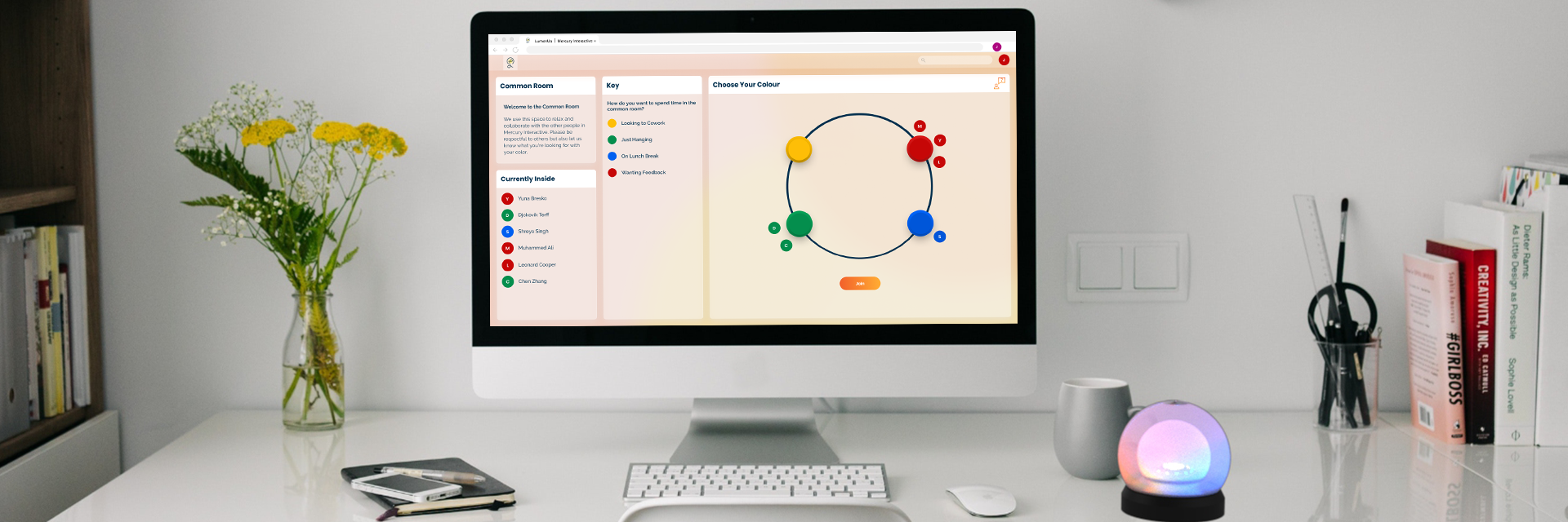
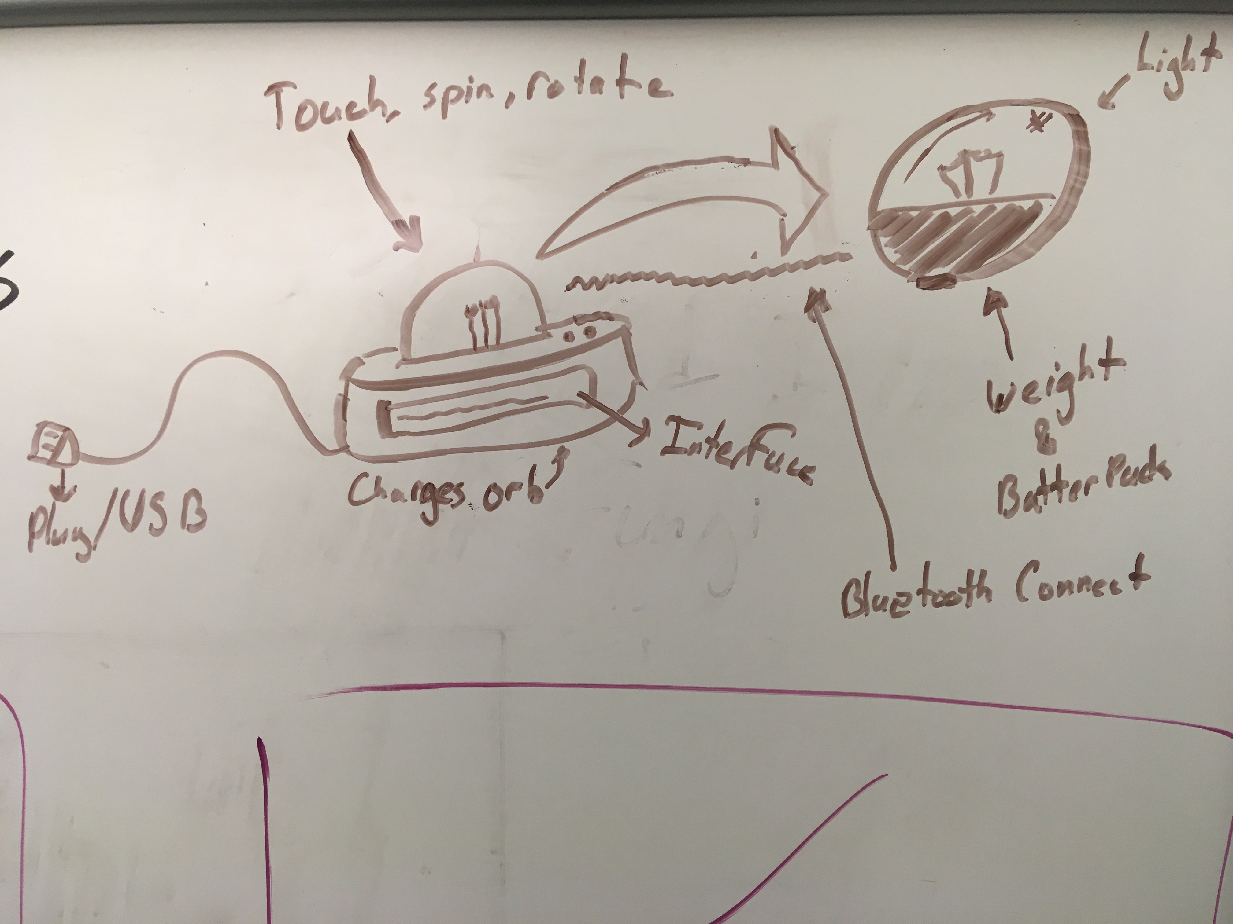
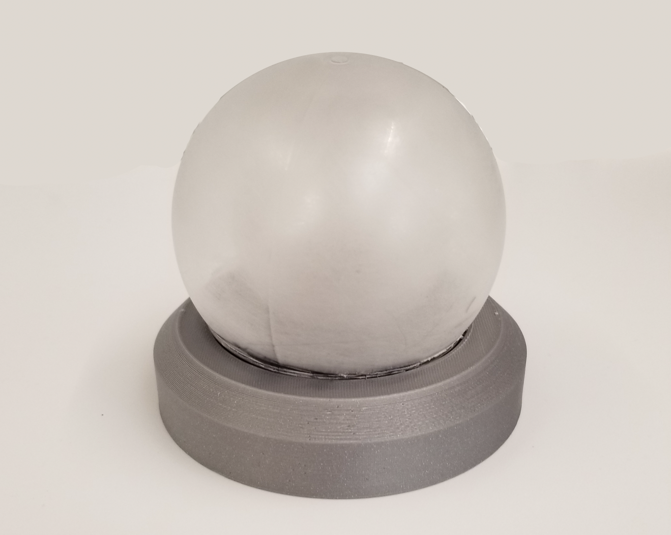
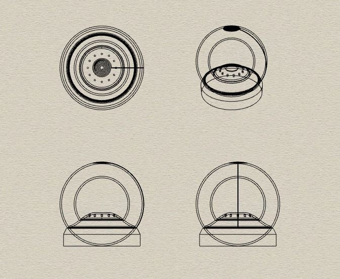
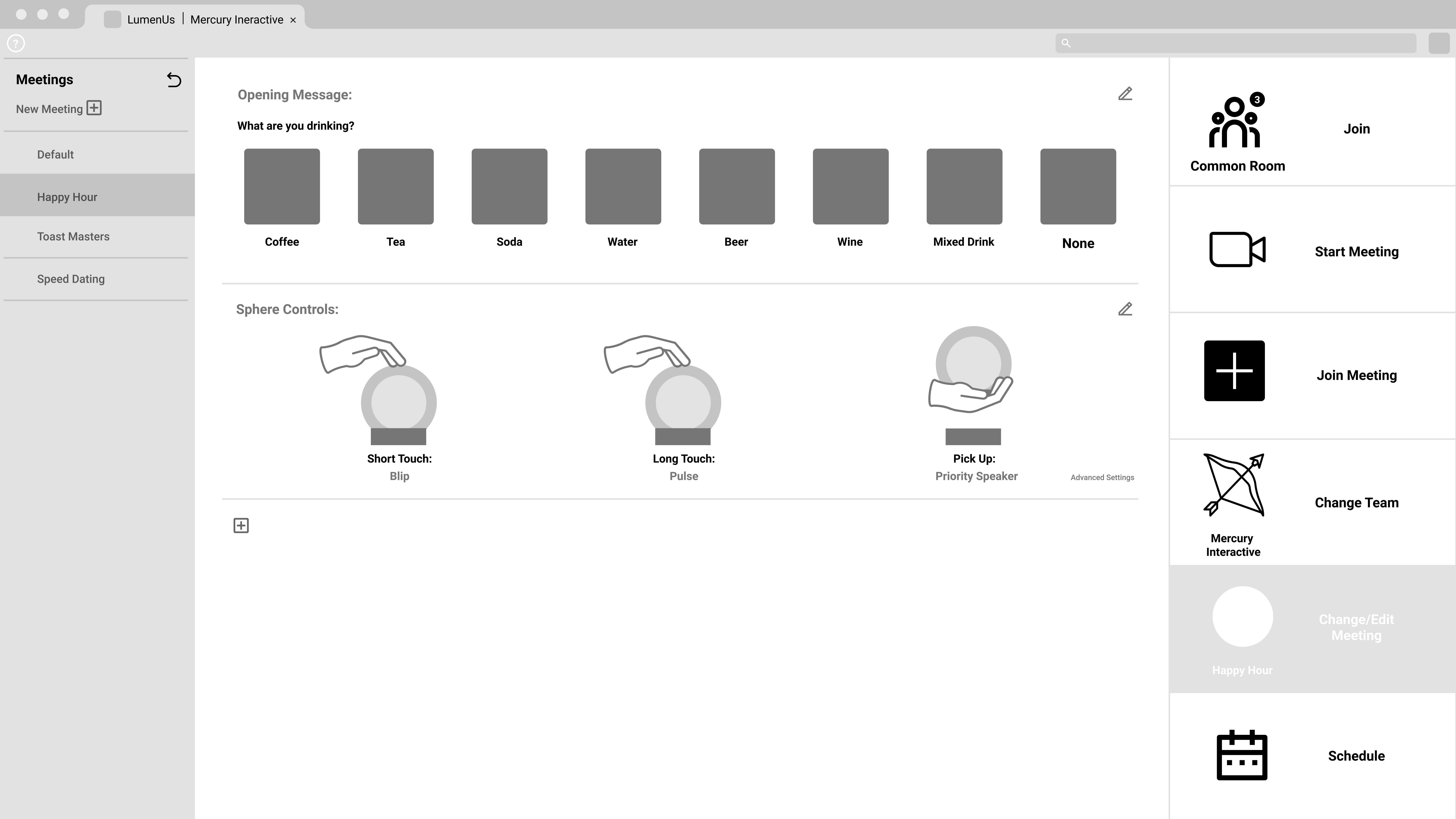
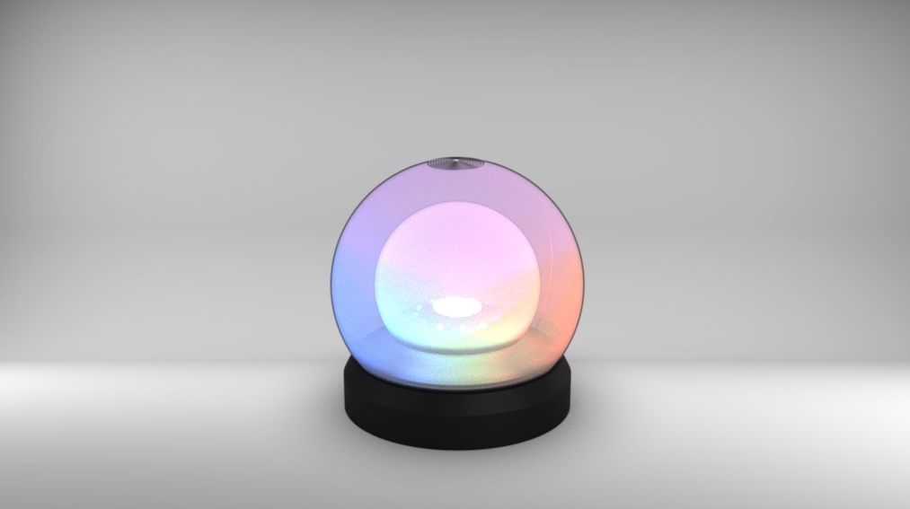
Luminus is a light and gesture based TUI that utilizes a central light as well as a ring of lights to give feedback on what is happening within the group. Through this we aim to reclaim some of the feelings of community and collaboration that are lost in our telecommuting work environments. This TUI is designed for use in small teams with a maximum of twenty users to a group.
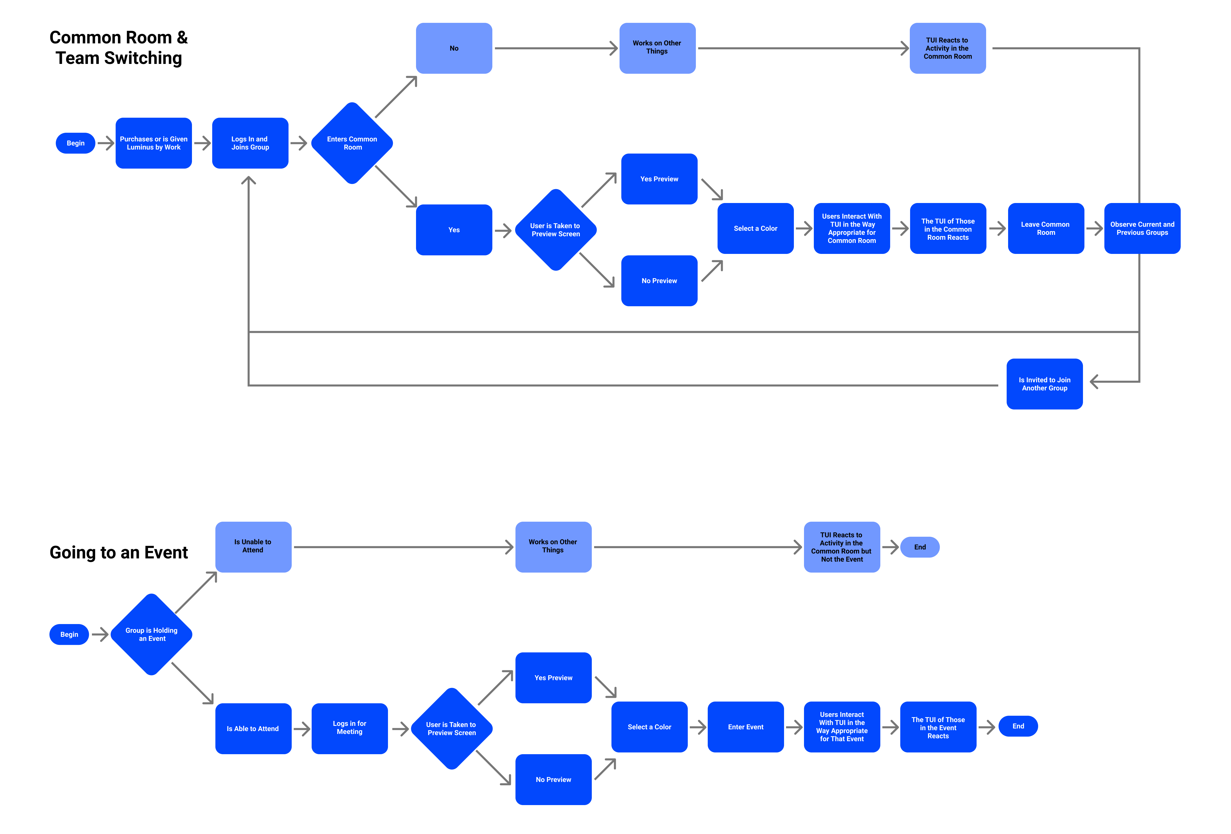
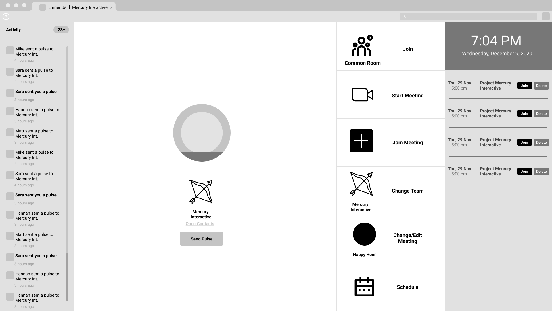
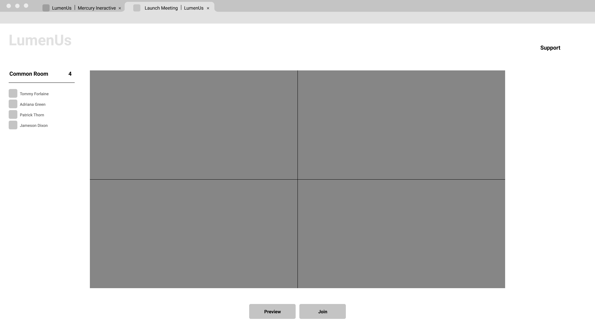
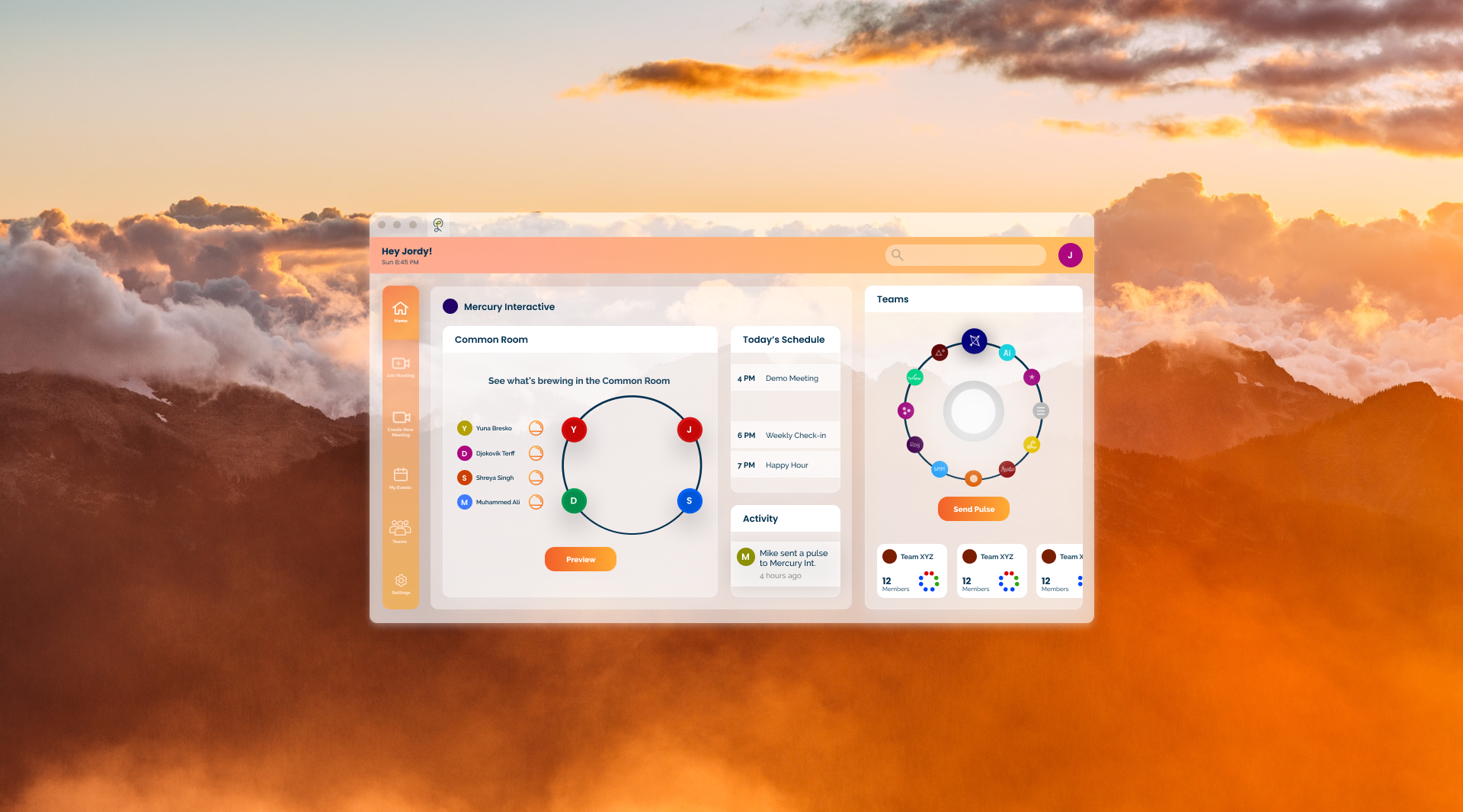
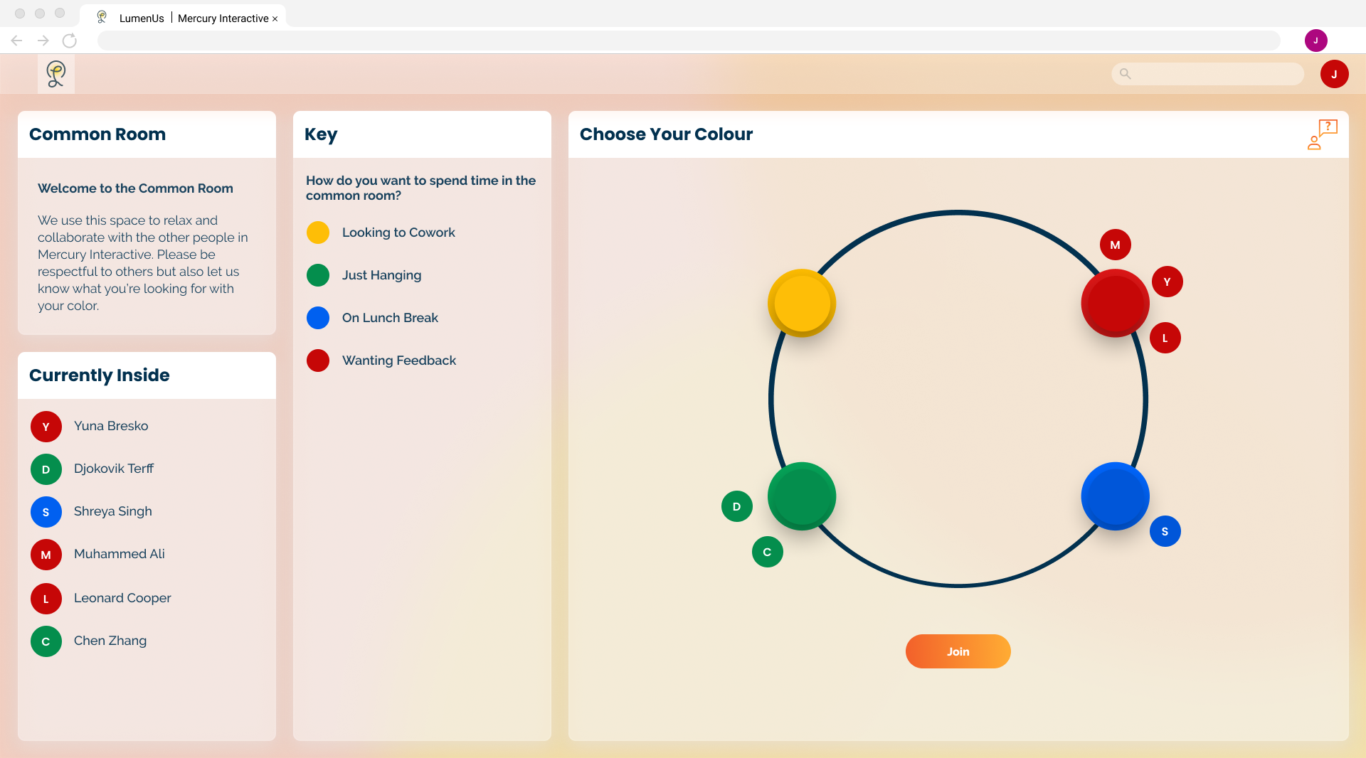
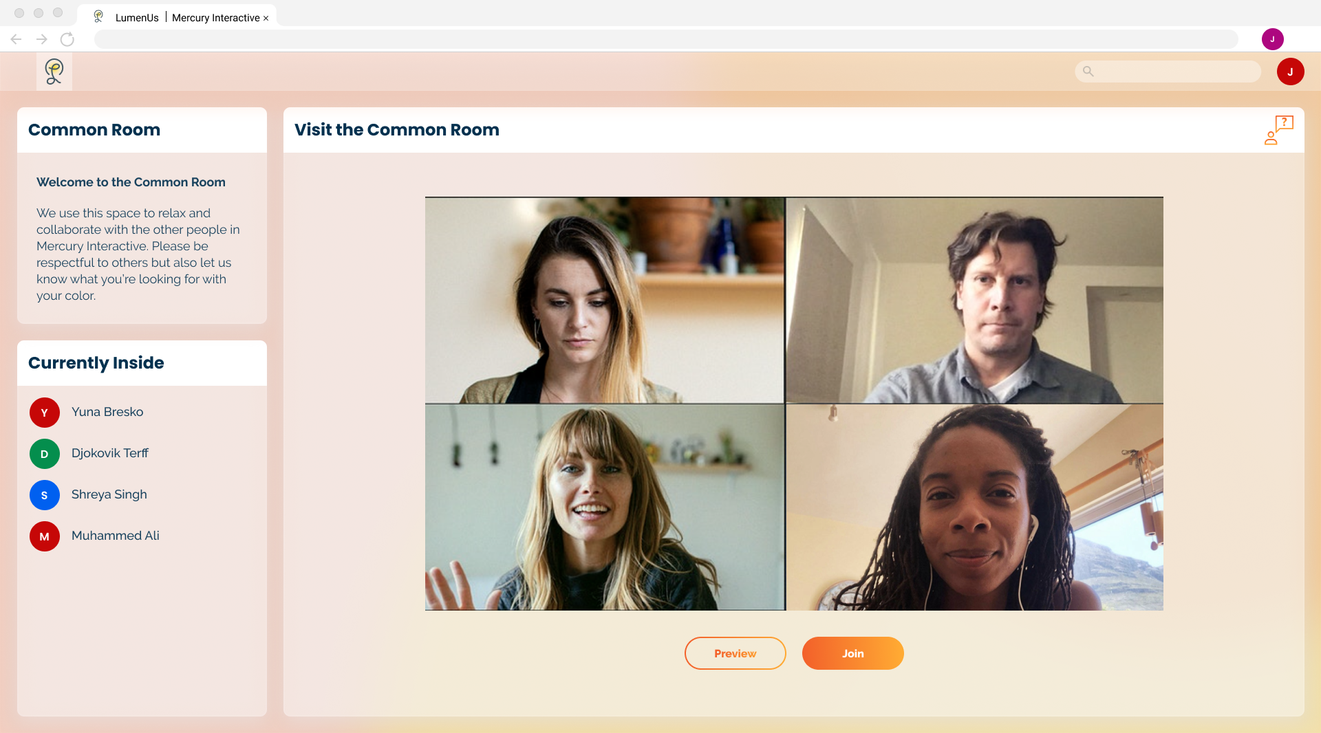
Each group has a video common room to act as a sort of gathering point. As people join the common room the Luminus Sphere of those in the common room and not currently in an active call will light up to reflect their presence. With this users have a way to get a quick sense of the activity in the common room and can see that they are not alone even if they cannot physically be together.
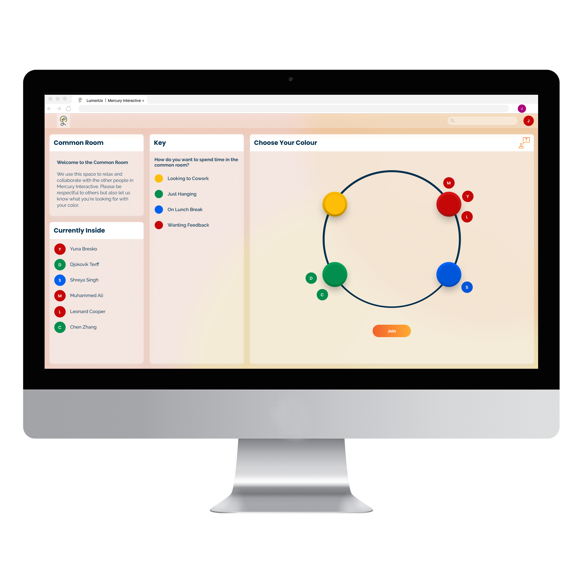
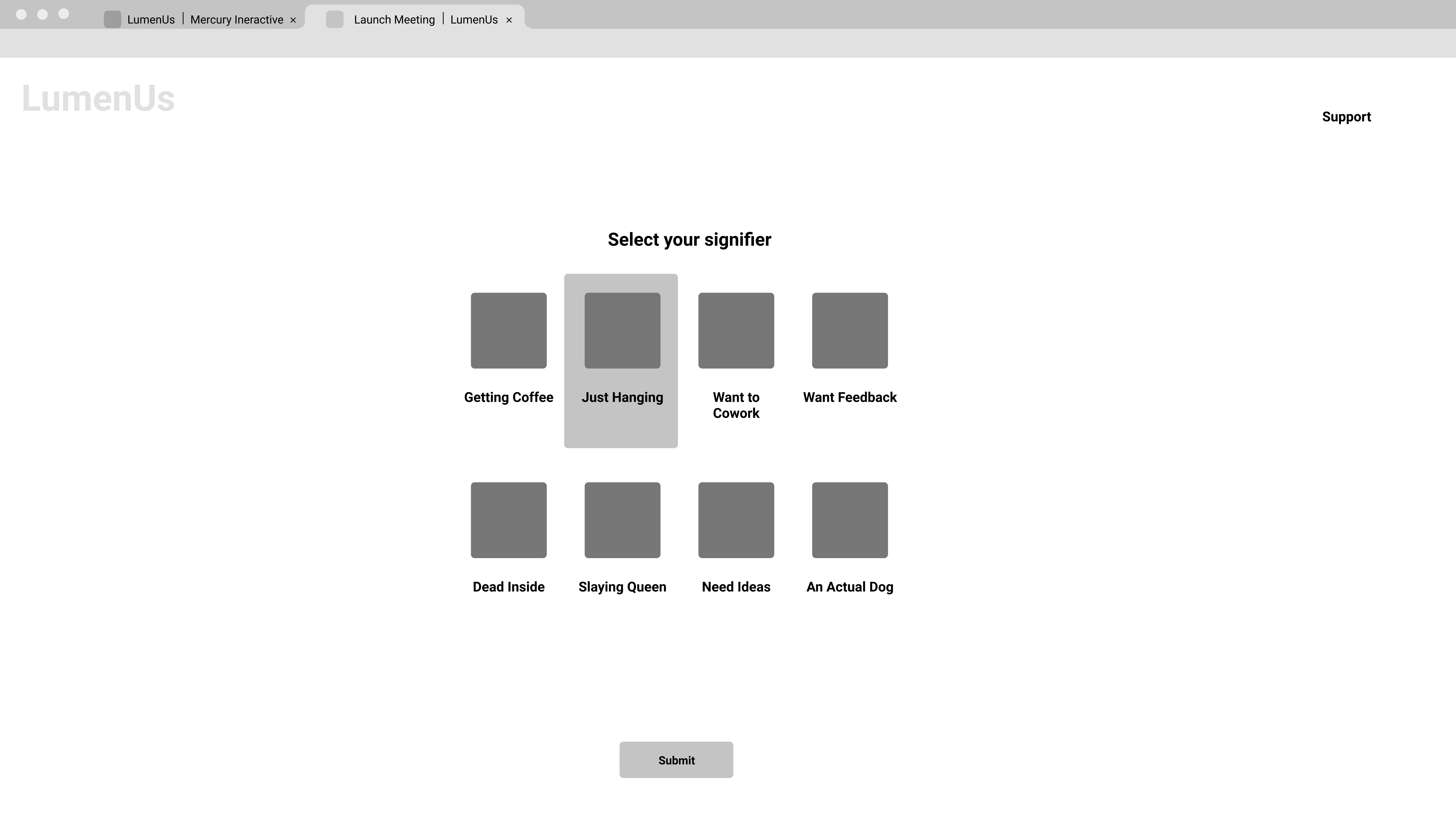
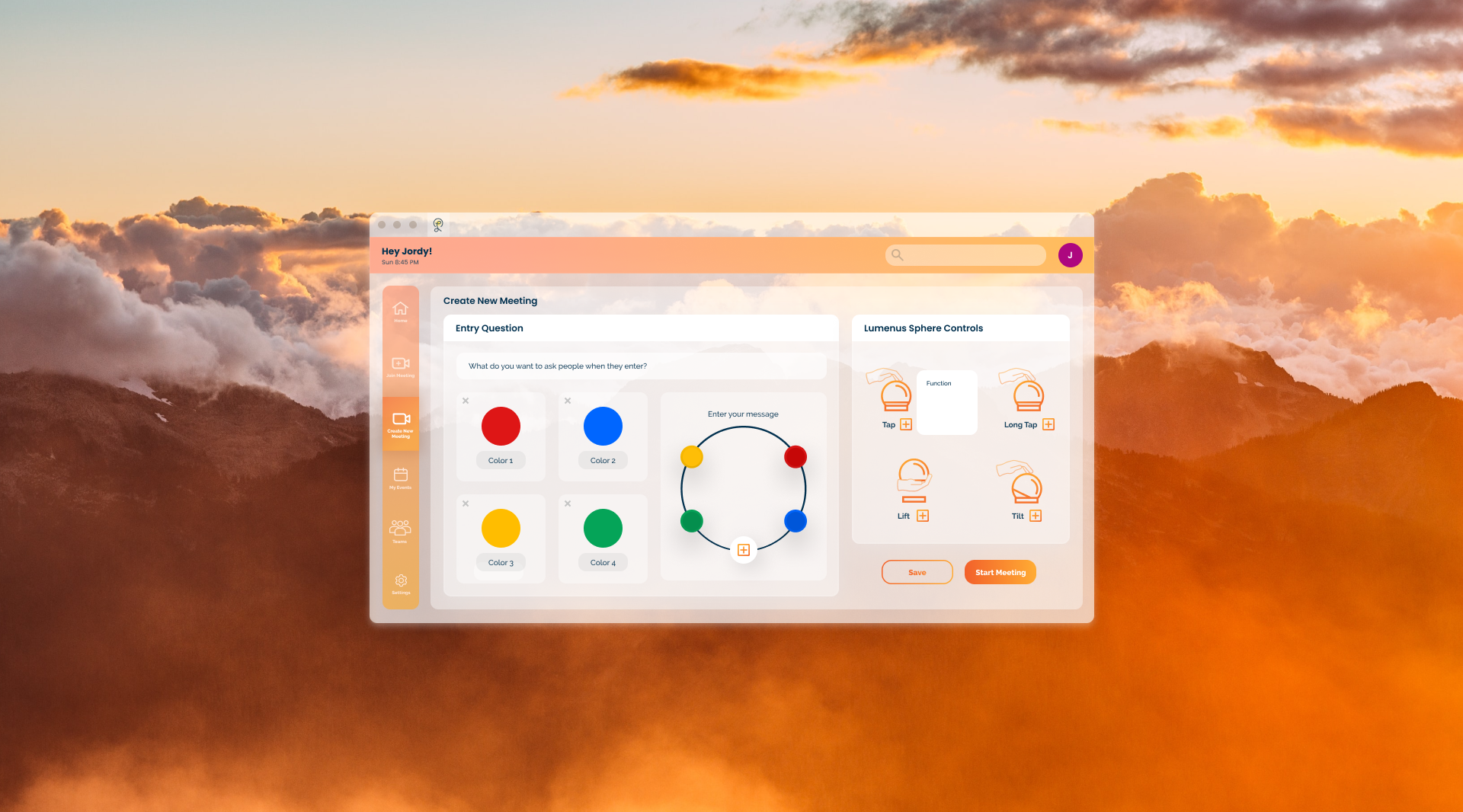
When entering a video call users assign a color to themselves to reflect their intention for being there. This way if a user is entering a call to just relax on a lunch break or seeking collaboration, their team knows their intention and can react appropriately. The meaning of these colors can be customized by the group or taken from our list of default settings. By doing this, Luminus can shift from a fun novelty at a happy hour to a more sensitive object for communicating emotional intent depending on the groups needs.
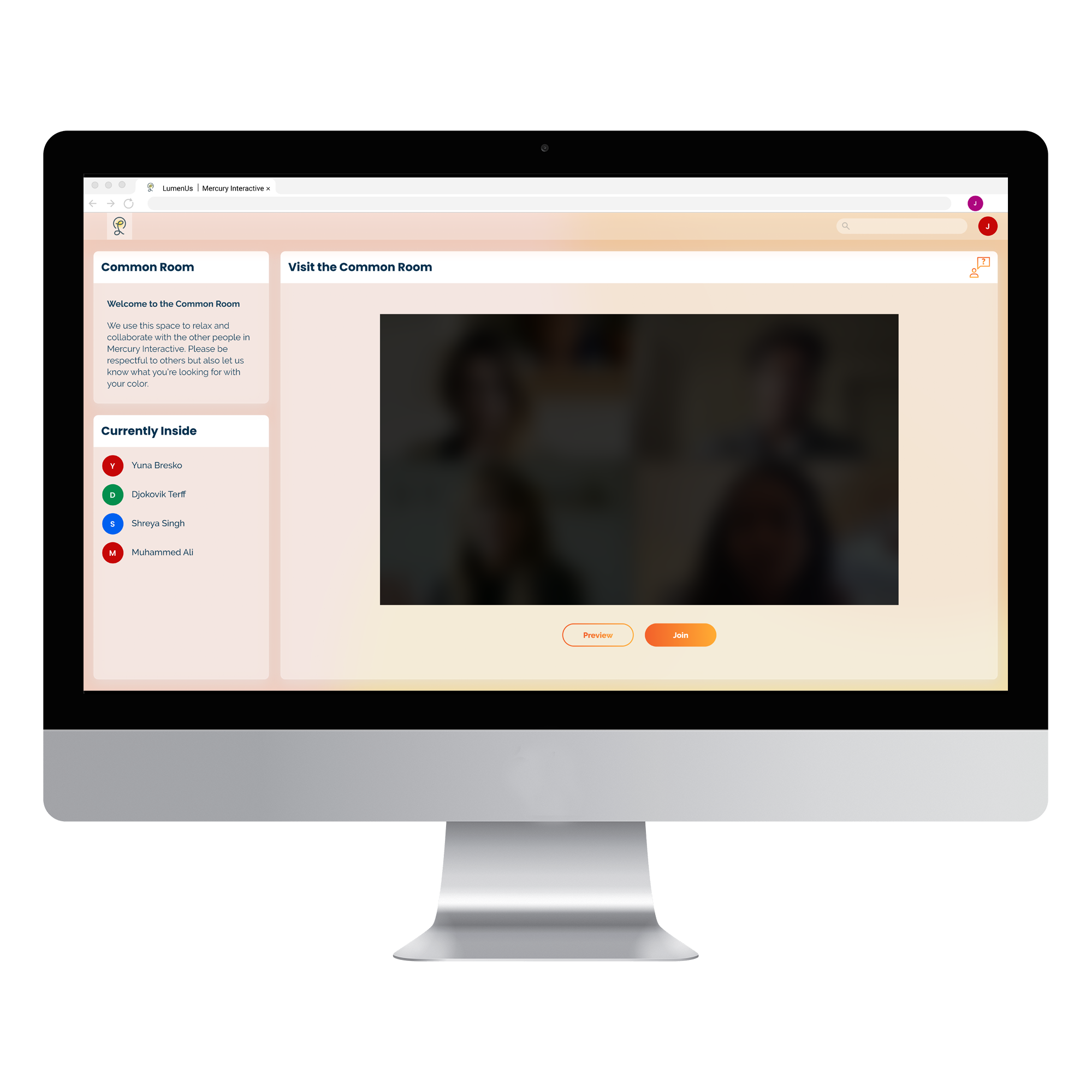
Before entering a call users may view a short preview of those inside in order to gauge if they wish to join or not. Measures are also put in place to prevent frequent previewing and thus listening in. When entering a video call those in the room will receive notice beforehand so as to reduce the jarring feeling of having someone just “drop in”.
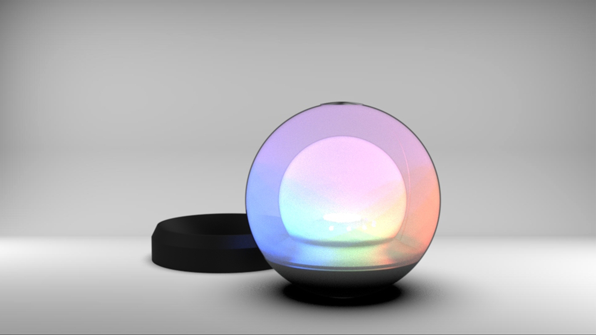
When in a video call users may send pulses of light to the person speaking. This is accomplished by touching the conductive surface of the TUI at the top of the sphere. Tapping will send a quick pulse, while a longer press will increase the light sent. This is to allow ways for users to interact with each other that is not reliant on a screen. It is even possible to turn off all video but still share in a dialogue and focus on the words being said and the light from the Lunimus Sphere. Through this we hope to aid in creating meaningful experiences and reducing “Zoom fatigue”.
Our team went through several cycles of the design process depicted. With each iteration we were able to hone our features into the product presented.

Since online collaboration is so ubiquitous our team decided to conduct interviews with a variety of working adults from different fields to see if there were any common themes. Five interviews were conducted with interviewees consisting of a professor, maker space manager, consultant, community leader and a corporate trainer. Many of them had pain points unique to their industry but there were also some common themes that we discovered.
Difficult to read the room
Zoom is too rigid of a platform depending on the type of meeting
Loss of community and relationships
Ordering speech/ showing intent to talk
Passively evolving interactions
Unscheduled moments
Flexible attention demands
After interviewing, our team began researching various forms of technology in order to find the best way to address what we had discovered. We also looked into group psychology and how people maintain focus while in person versus online in a video call. Regarding tangible user interfaces, we were able to isolate multiple factors to remain aware of.
TUI Strengths
A well designed object adds to a space
Disrupting screen time
A more physical way to interact
Able to be peripheral and subtle
TUI Weaknesses
Potential for clutter
Learning curve
Fragility
Ergonomic issues
As our concept developed and changed we adjusted our form to address this. This ranged from accommodating grouping teams to rotation as a metaphor for time to capacitive touch in order to send light. We also had to consider how much we wanted users to focus on the TUI from a passive form to turning off the video and focusing solely on it and listening. All of these required different coding, forms and material considerations.
Our research took us in many different directions. Initially we thought a TUI would be best for a learning context in running workshops. As we progressed we found that the emotional and psychological side of design with a TUI was far more compelling than focusing mainly on administration. Additionally a TUI has some real limitations on how many people it can engage at a time without muddying the communication channels. This was a large factor in deciding to reduce the size of the groups we wanted to use.
Pulses that one could direct to individual participants was a feature we spent a large amount of time trying to develop. Due to the scope of this project and the level of complexity this introduced we had to cut that feature but acknowledge that there is still potential to develop it as a next step. While our team did practice with this object and run through scenarios, more usability testing would bring about new learnings on how to develop our product. Designing for mobile would also valuable be a next step.